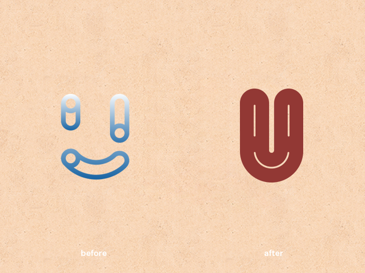
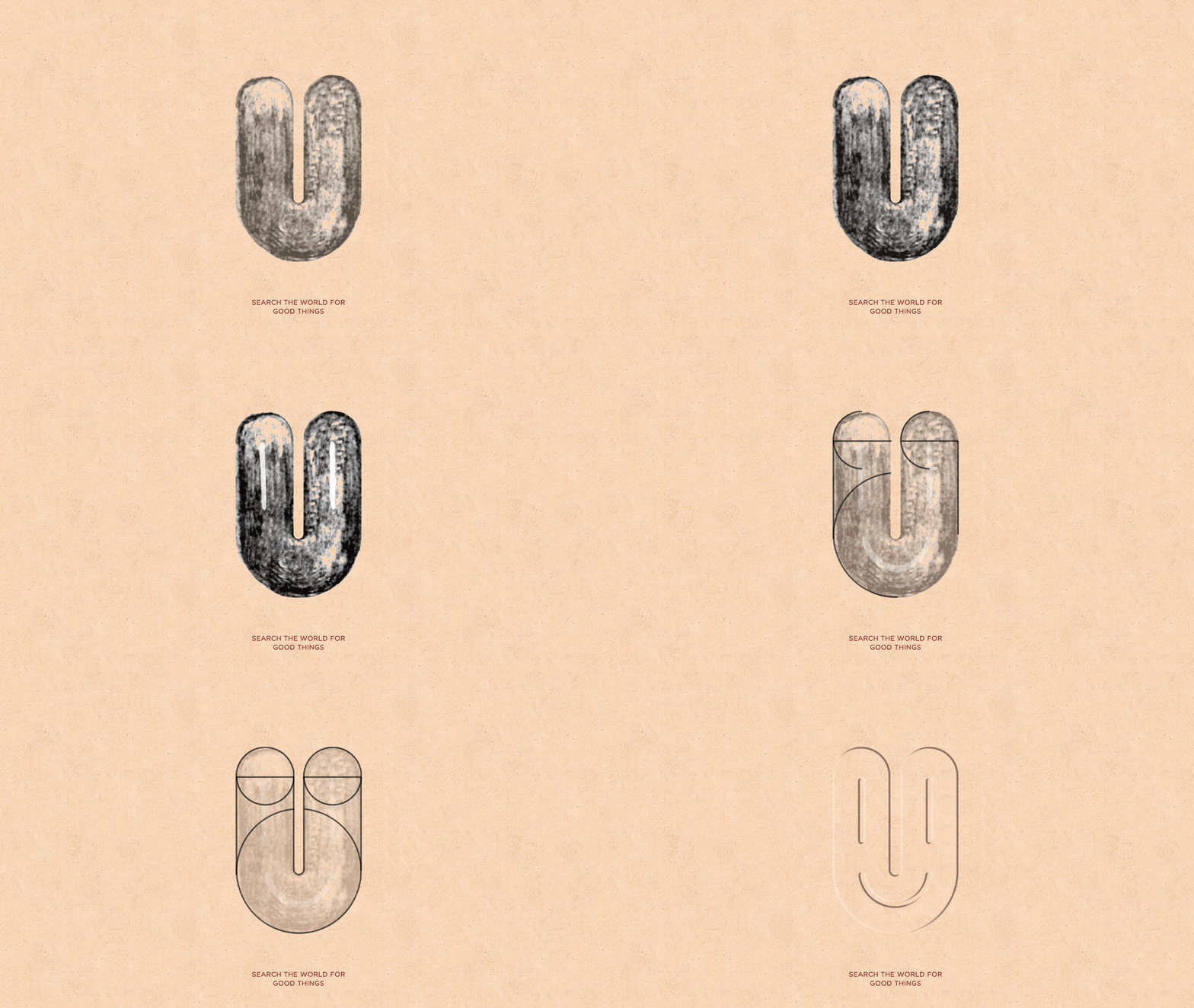
The brand is based on a blend of simplicity and vintage & modern. The first association has to do with attraction, not so much the search for global goods as a kind of "magnetic attraction". This attraction can be nature, people, things, attitudes to life... In order to deliver healthy environmental protection and artistic appeal of home lifestyle. We hide the letters U N E E I in the shape of the logo icon U to strengthen the core meaning of the brand "You need it", so the overall appearance is both a "small magnet" and a happy smiling face, which increases the affinity of the brand with interesting colors of characters.
该品牌以简约和復古&現代的融合为基调。第一个联想与吸引有关,與其說搜尋全球好物不如比喻是一種“磁吸效應”這種吸引可以是自然、人文、事物、生活態度...的凝聚,為的是傳遞健康環保及藝術感染力的居家生活方式。我們將logo圖標U的形體中隱藏其字母 u n e e i 為強化品牌核心意義“you need it” ,則整體外形呈現即是一個“小磁鐵”又是一個洋溢著幸福的笑臉,為品牌增加親和力同時帶有人物趣味性色彩。
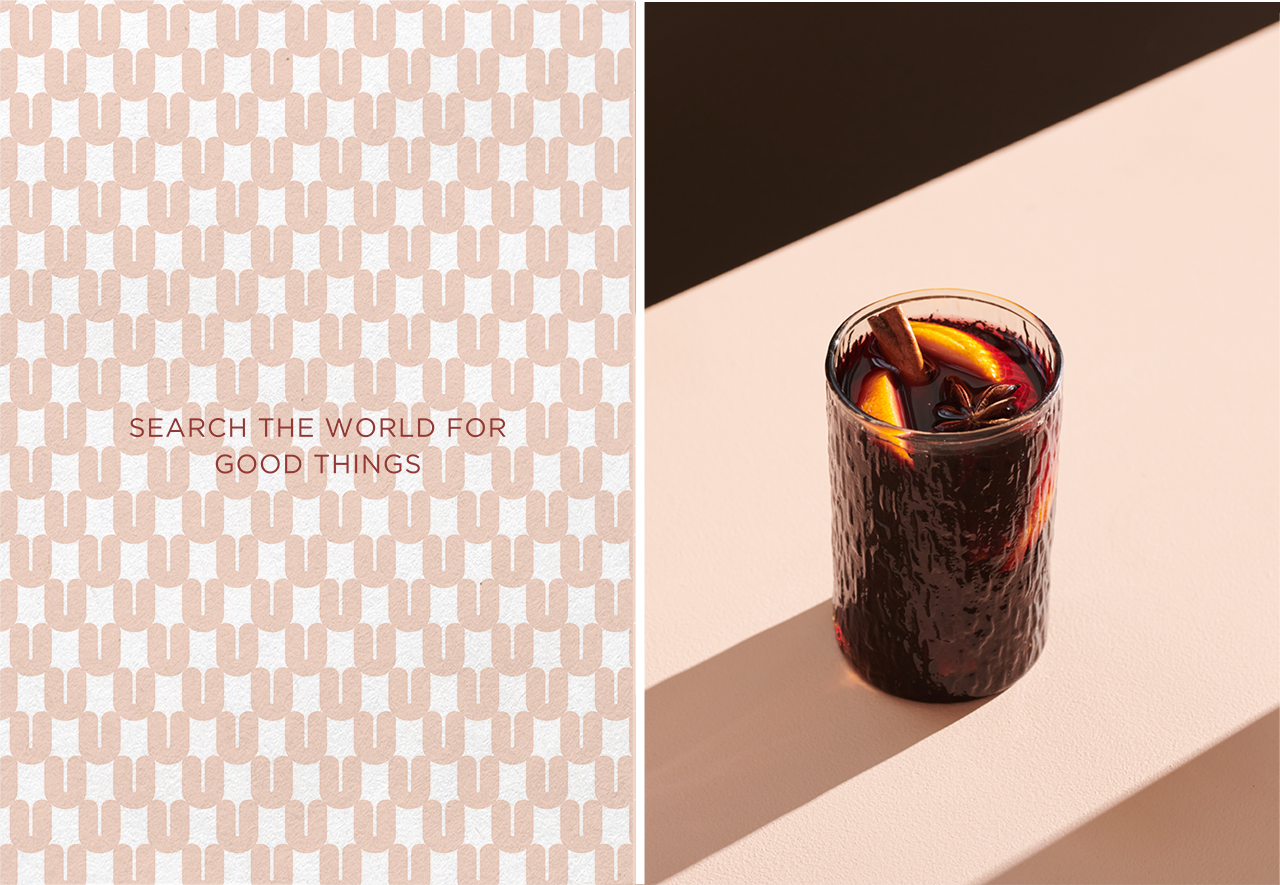
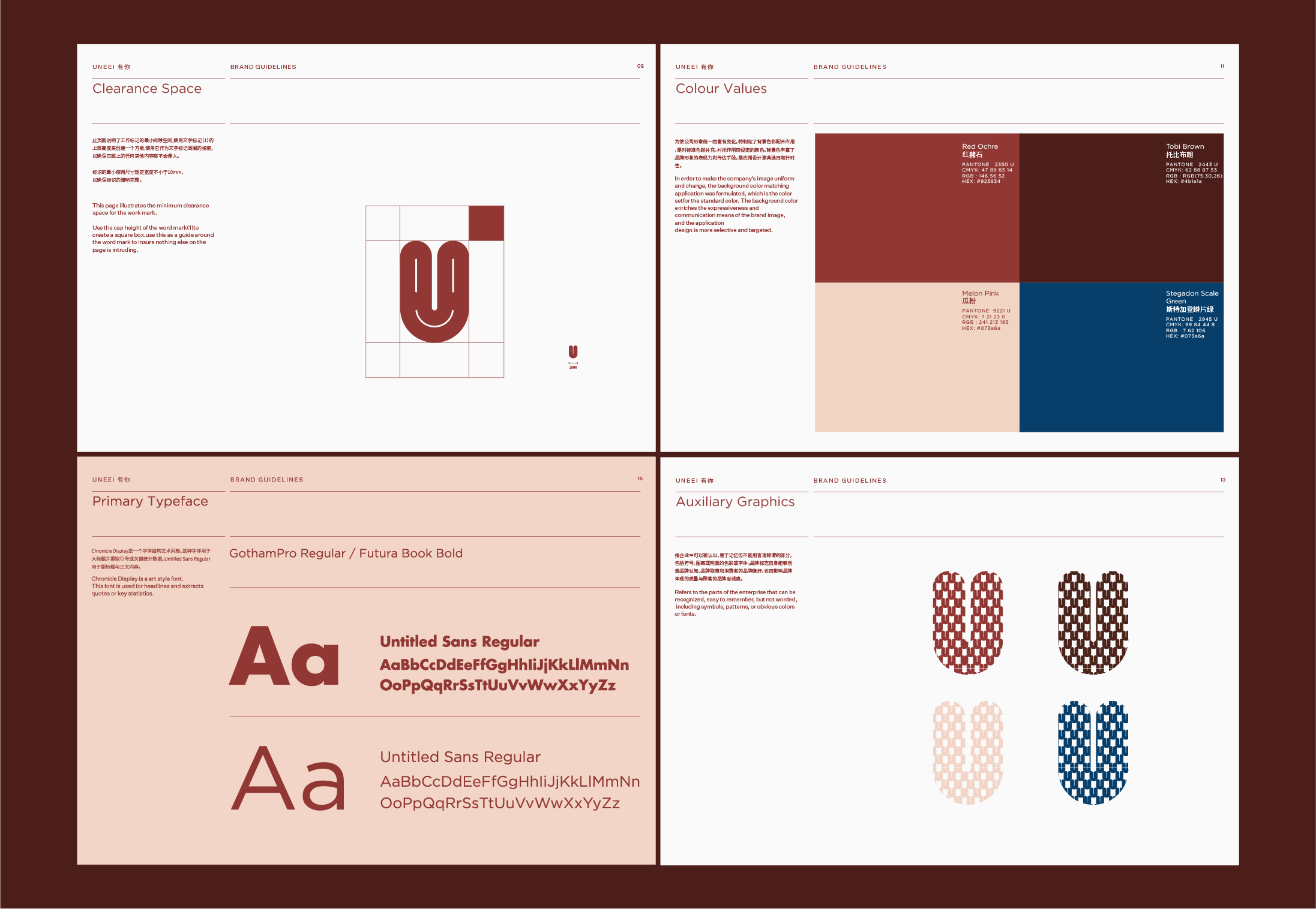
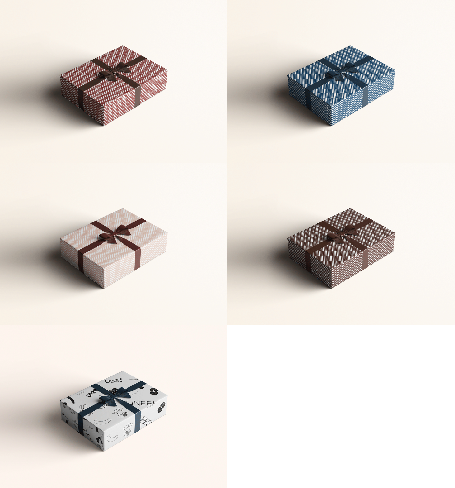
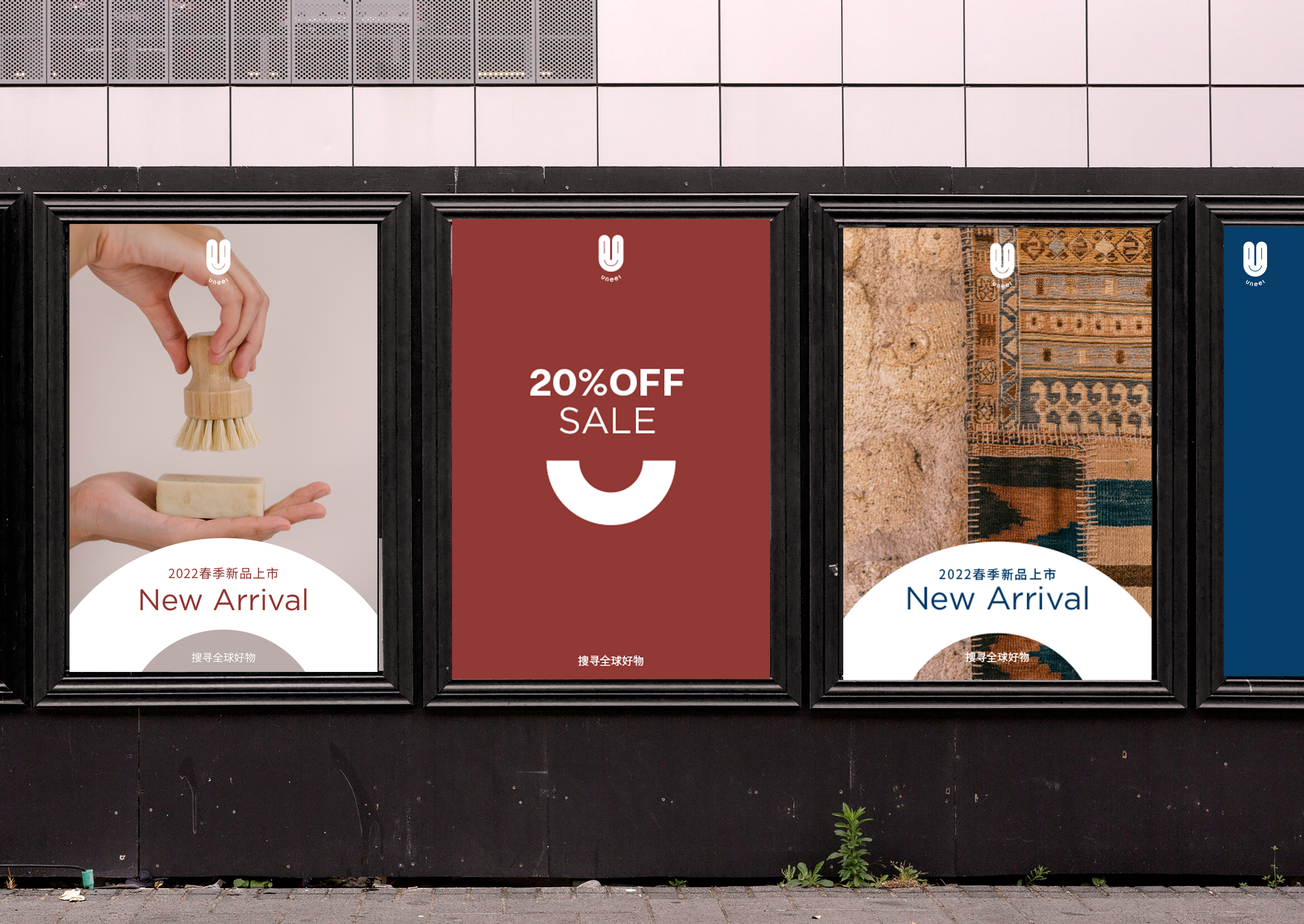
For typography, we chose Untitled Sans, a versatile, neutral font. For the color palette, we borrowed the concepts of happiness and nature to embrace natural colors. Inspired by Crete, the largest island in Greece, the reputation of a garden on the sea is in keeping with our brand's concept of natural comfort and happiness. The uncaring Scale green of Strigaden is softened by optimistic red ochre, complemented by more sober tones between Tobey Brown and light beige.
在版式要求上我们选择了一种多用途的、中性的字体Untitled Sans。對於調色板,我們借鑒了幸福和自然的靈魂,擁抱自然的顏色。靈感來源希臘第一大島--克里特島,有海上花園的美稱正符合我們品牌“自然環保能量者”的概念,假裝不在意的斯特加登鳞片绿被樂觀的紅赭石柔化,並輔以托比布朗棕和淺瓜粉之間更温暖的色調。

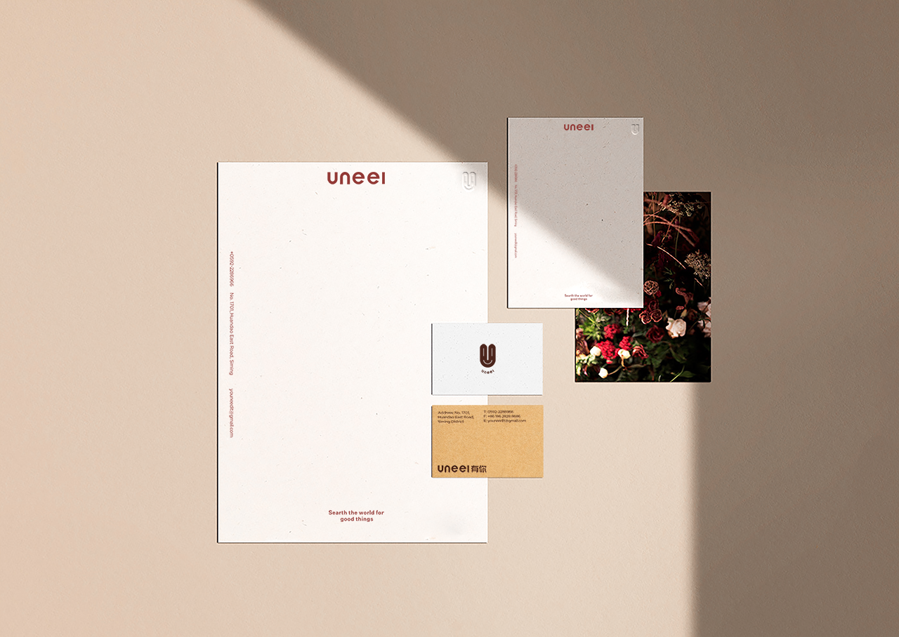
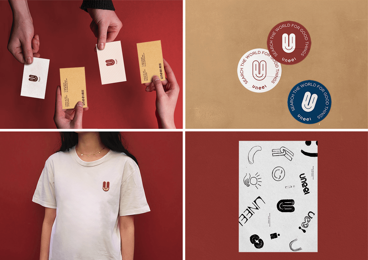
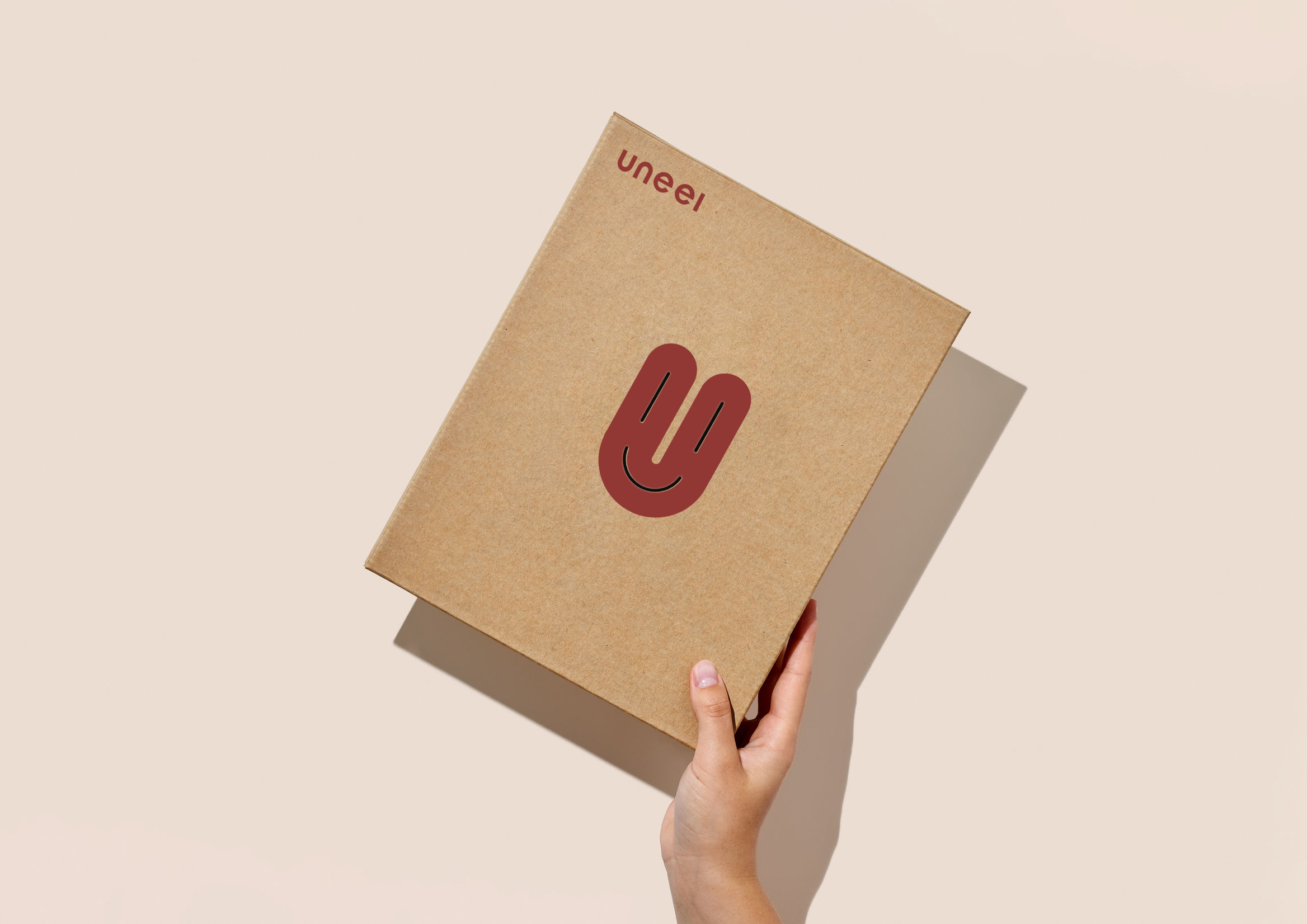
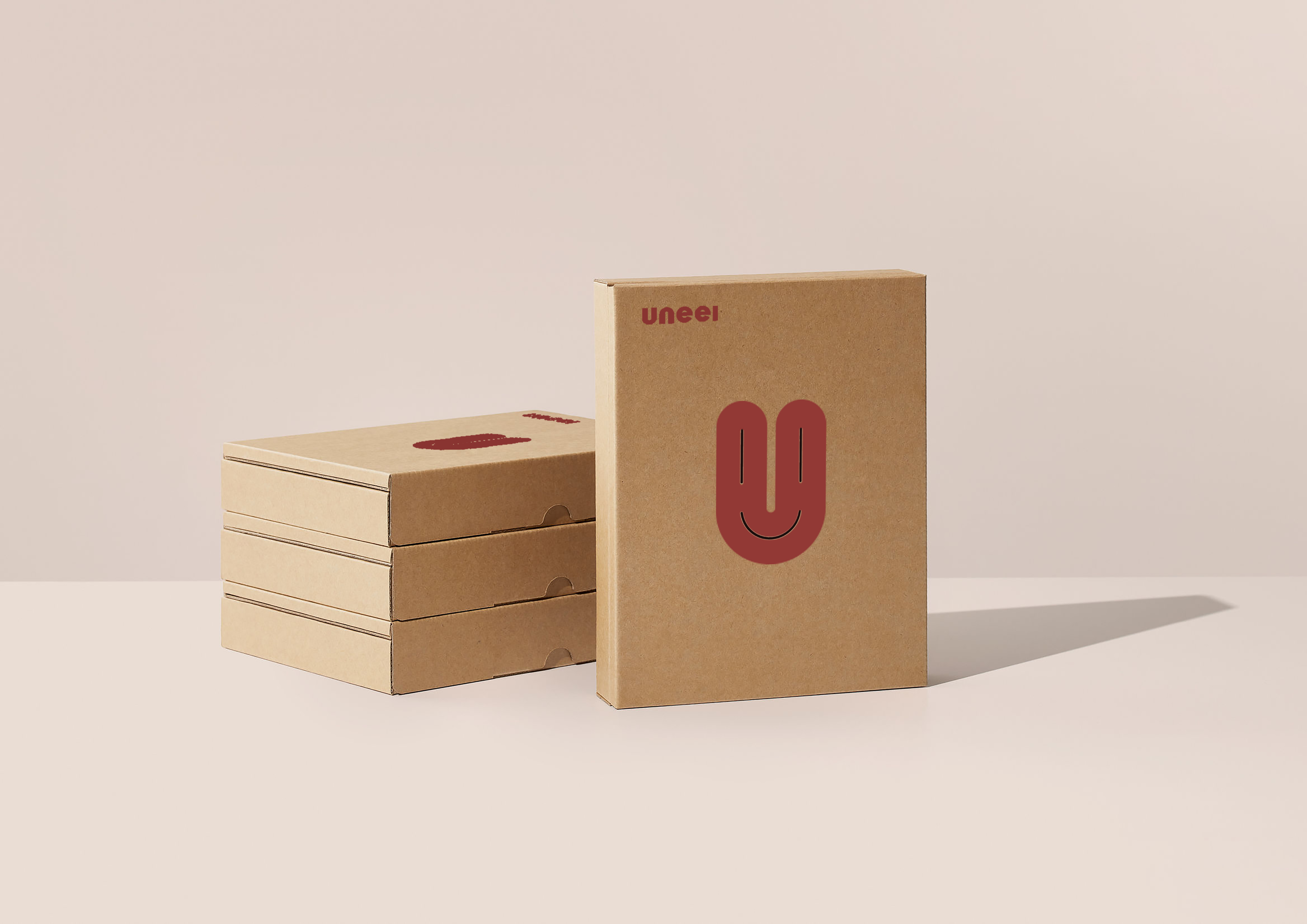
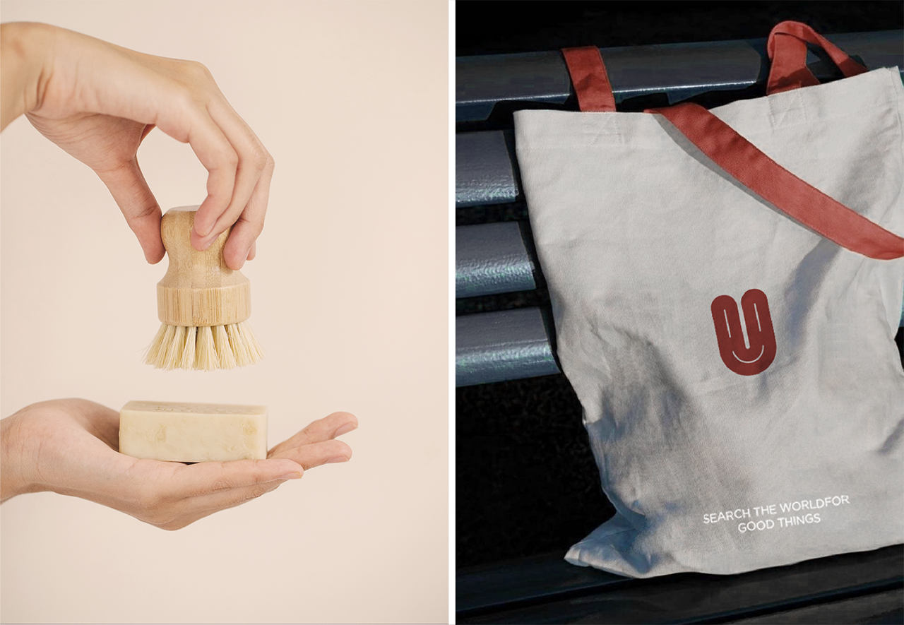
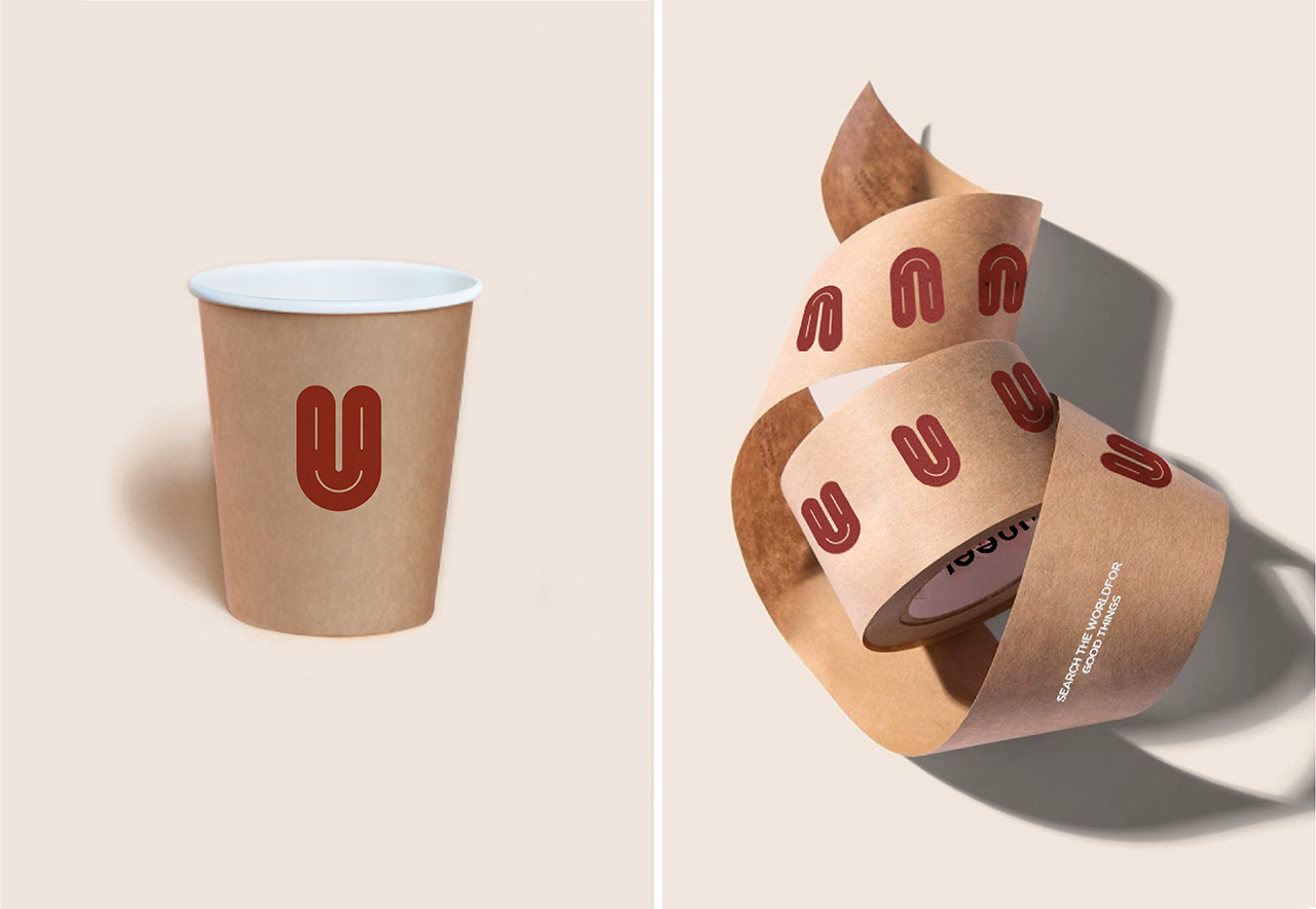
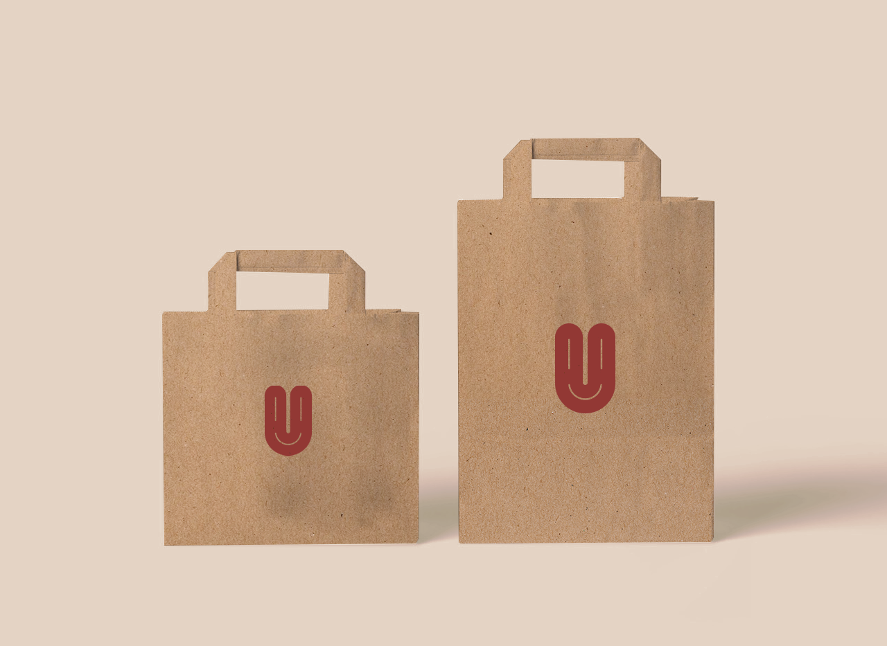
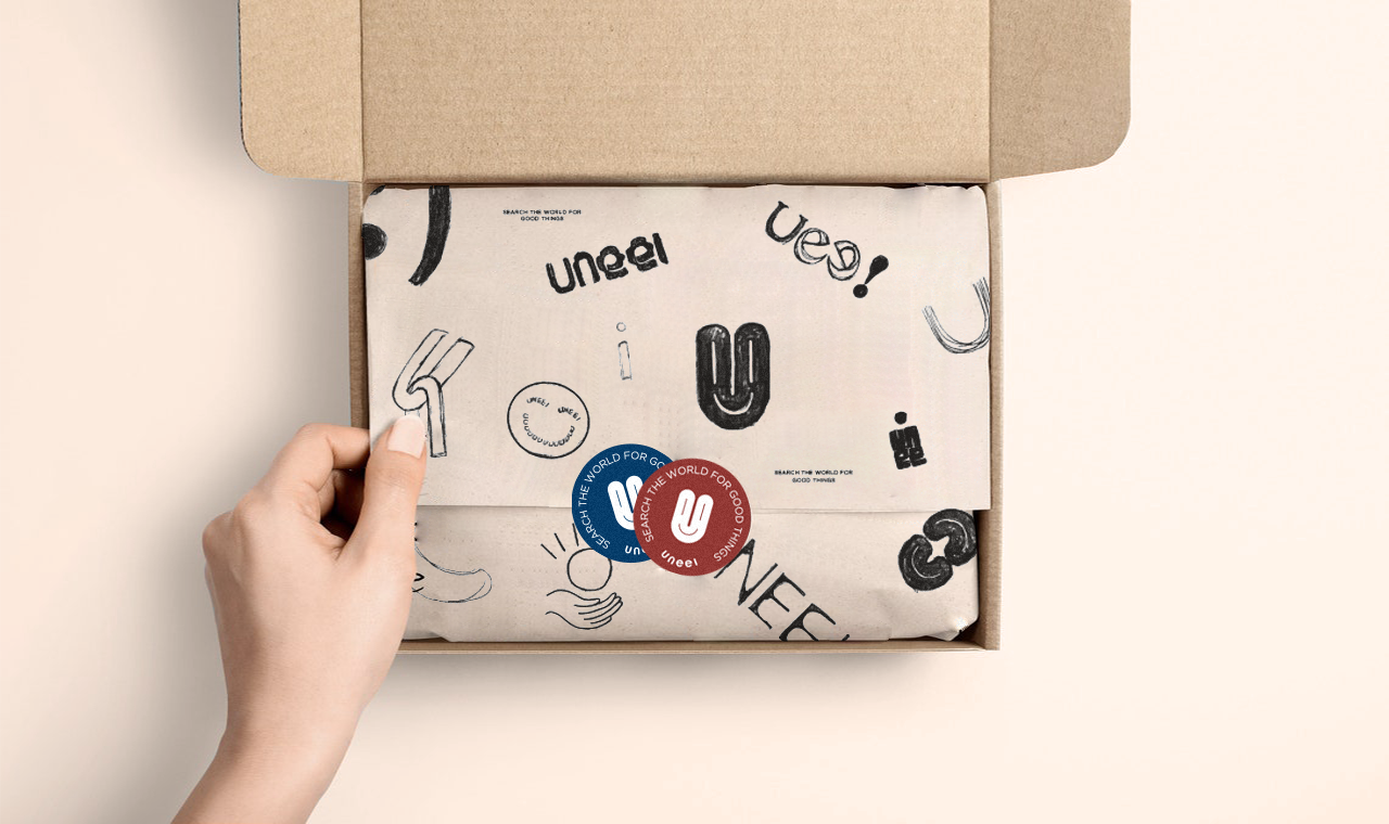
Finally, in order to fit the health and environmental protection, we printed all materials on kraft paper and original cloth embryo, hoping to retain the most original and clean visual consumption experience.
物料呈現上為貼合健康環保我們將所有材質以牛皮紙及原布胚印刷,希望能保留最原始乾淨的視覺消費體驗。
 Add more case...